Do Now: Tuesday 25th February 2025
- 2
- 70%
- 30% 40%
- To make money.
What is advertising?
The main aim of advertising is to bring attention to a product, service or issue.
Depending on the campaign, it might also:
- Raise awareness
- Inform or educate
- Persuade audiences
- Create a unique selling point(Making something different to other products)
- The main aim of advertising is to bring someone's attention towards a product, service or issue in certain way such as creating a unique selling point to show the differences to other products.
- The differences between commercial and non-commercial advertising is that commercial aims to promote product mainly for money where as non-commercial is to make people aware and catch their attention to something such as charity and donating.
Do Now: Tuesday 4th March 2025
- To show something. Get the audiences attention
- persuade audiences, raise awareness.
- To make money.
- NHS- Raise awareness.
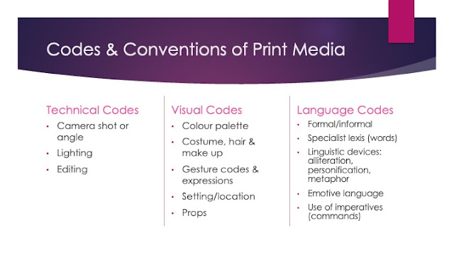
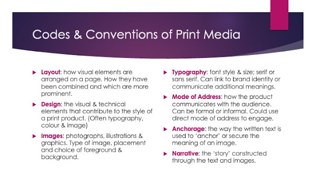
- What is contained on most media products.
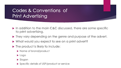
Codes and conventions
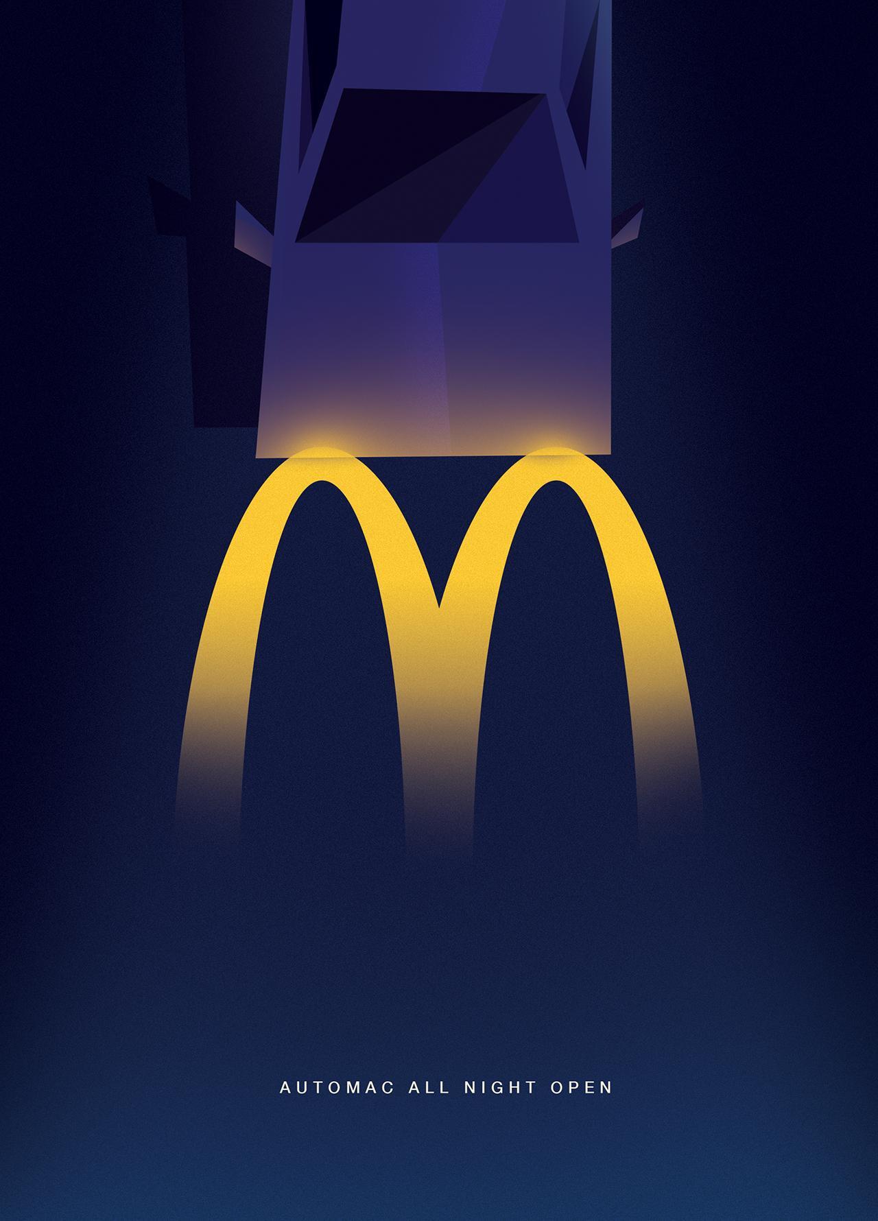
The aim of this advert is to target an audience that likes to eat but also shows that there is an open space to eat whenever they like as its 24/7. They use a bright colour amongst the dark to show connote they are the brightness in dark and offer a place of warmth and welcome throughout the night. It is a soft shell product as they are not presenting any food on the advert to the consumer.


Do Now: Tuesday 11th March 2025
- When they promote a lifestyle or values.
- The product and brand name and possibly a slogan.
- Slogan, Rhyme, Facts.
- Hyperbole, Alliteration.
- Repetition.
Intertextuality:
This advert uses intertextuality because it references Humpty Dumpty which shows the jeans being long withstanding due to the reference of him falling off the wall and the tagline says "little toughies" This hints to the good quality. They have used this intertextual reference because they are trying to suggest the strength and long lasting material of their kids jeans through protecting Humpty Dumpty from breaking/falling off the wall.

Historical Advertisements
The logo and slogan are placed in the bottom corner which follows the z pattern to catch the viewers eye off the brand. This has also been done in colour to highlight the slogan and logo which has also been put in the classic red colour. The images convey the idea of the the woman that has been playing sport has now been refreshed with their brand"Coke/coca cola" The colour white has been used to show that when coke is drank it is as if your in heaven and enlightens your life however it could also be used to highlight the trademark colour red of their product and highlight the name and logo. The quote"wonderfully refreshed" is used to present the product as a way to make you be the best version of yourself.

- Very colourful.
- Very eye catching.
- fancy fonts.
- colour shows success in the product due to price of printing.

Do Now: Tuesday 25th March 2025
- Mackintosh's.
- Major quality, Miss sweetly.
- Regency period.
- People who don't have as much money-working class.
- Alliteration, emotive language.
- Has been shown in bright colours to entice the viewer to buy the product.
- The use of the product in large images to give the viewer a clear view of the product.
- They use 'delicious dilemma' for not only alliteration but also emotive to make the reader believe all the the flavours are as good as each other which is shown through the dilemma people are confronted with.
- They appear to be dressed in posh clothing which suggests the upper class however the brand aims for the product to be cheaper for working class families.
- They use the image as the biggest part to catch the viewers attention which then draws them in to look more at the cover which also provides a picture of the product.
- The typography used is to highlight the amount of flavour there are this gives the viewer the idea to buy these chocolates because not only are they cheap there are so many different flavours which makes the person buy to try all of them.
- They also use the traditional colour of the box of quality streets on the brand to not only highlight what it is but entice the viewer with the contrast in colour to enlighten the product.
- Delicious dilemma on one hand is picking between the sweets but also how the woman are dressed to look like sweets(objectified) to show the mans choice in multiple ways(sweets and the woman).
The main image shows the mans dilemma this is provided on the bold image where it is shown everyone to be looking at the sweets including the man however he also has a problem with which woman he will pick where they have been objectified in a treat shown through the way the two woman are dressed. Furthermore, the image also presents the people on the image to be dressed very formally and posh which suggests them being of the upper class which is furthermore reinforced by the golden colours used throughout the main image. This is used to show that for the cheap price of what they are even the more upper class people still consume as if creating the idea of making the middle working class feel rich and enlightened. [5 mark]
Do Now: Tuesday 1st April 2025
- Something used to portray something else.
- 1950s
- As an object
- Working class
- Delicious
Do Now: Tuesday 22nd April 2025
- Something used to portray something else.
- 1950s.
- As an object.
- Working class.
- Delicious.
Male Gaze theory:
- The way in visual arts and literature depict the world and women for a male point of view(presenting woman as objects to pleasure men)

- Green effect: The man being put in the centre of the image creates the idea of superiority which connotes wealth but also power over the surrounding people all looking at what he has(The box of sweets)
- Yellow effect: The effect is it presents not only the women as objects but also the man has to choose between the two giving him a dilemma(delicious)
- Blue effect: The effect of presenting the man in a suit connotes superiority and also wealth due to the posh and formal uniform he is dressed in showing that men are the ones working whereas the woman are shown to be less.
- Purple effect: The sweets are placed in his lap to as if show and create the idea of the sweets being presented in a sexual way and that it is as if like a treat for the two woman. Hence the kissing on the cheek also creating the idea of the sweets being presented as male genitals.
The gender of men and woman have been portrayed very differently through the advert. The man for instance has been placed in the middle of the image with the box of sweets as if the eye is automatically appealed to looking towards the centre of the image as if showing the hierarchy of the man. Whereas thee women are put to the side at the same time as being dressed to represent a sweet as if like a treat for the man. The interaction between the male and female character are significant because it shows the dominance of men over women throughout the 1950s with the man having the sweets placed of his crotch which the women are ultimately kissing his cheek whilst also reaching out for the sweets.
Exam questions:
Q1) 15 Mark question(split into 3 parts)
Q2) 25 Mark question- Compare to an unseen advert.
Do Now: Tuesday 29th April 2025
- The meaning behind something.
- Wealth, power.
- Friendly, vicious
- Women are presented in a certain way to please the male eye.How the majority of media texts present the world.
- An image that represents the brand.
Analysing modern adverts:
Positive:
- Interested
- Curious
- Handicapped
- Disabled
Negative:
- Nosy
- Retarded
- Crippled
Logos:
A-ADOBE
B-Barbie
C-Coke
D-Disney
E-Ebay Explorer
F-Facebook
G-Google
H-Honda
I-IBM
J-JBC
K-Kellogs
L-Lego
M-Mcdonalds
N-Nintendo
O-Oreo
P-Pinterest
Q-Quicktime
R-Reeses
S-Skype
T-Twitter
U-UNI Leaver
V-Virgin
W-Wikipedia
X-Xbox
Y-Yahoo
Z-Amazon
Persuasion in adverts:
- Rhetorical question:A question that doesn't have to be answered.
- Repetition: Time after time- Repetition of words.
- Alliteration: Harry hurried home- Same letters repeated one after the other.
- Emotive language:The beautiful sunset painted the sky with vibrant colours-A certain description to make you feel a certain way.
- Opinion as fact: All people are beautiful in their own way- An opinion that is stated to be true.
- Celebrity endorsement: Michael Jordan endorsing nike shoes- Celebrity supporting brand.
- Hyperbole: Im so tired I could sleep for year- Figure or speech used for exaggeration.
- Facts and statistics:The earth is round,The average height off a male from the US is. 5,10-True information one including numbers.
- Direct address-You should go to that restaurant- Communicating to a certain audience or. individual.
- Imperative-Close the door-Gives commands, requests or instruction.
- Repetition, Imperative, emotive language
- Direct address
- Triplet, Opinion as fact
- Alliteration
- Hyperbole, Opinion as fact
Do Now: Tuesday 6th May 2025
- Hyperbole,Alliteration,Direct address.
- Exclamative.Imperative
- Alliteration.
- Direct address.
- Hyperbole.
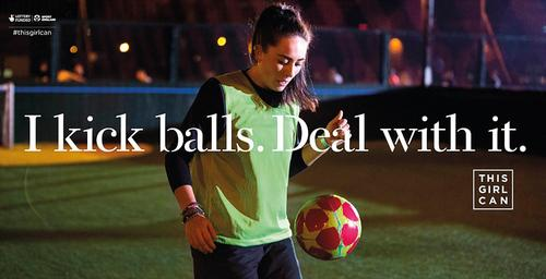
Women in advertising

Mantras:
That men who only think they should play football and not woman need to realise that its not only a mens game but an all inclusive one and that if they don't like the fact that woman play football then they need to deal with it.

Gareth Bale: Lucozade advert
The image shows a young Gareth Bale who used to be a footballer however at the time he was. This connotes the idea that Lucozade is used by Gareth Bale which enhances his performance in matches. They contain the image of him on the front cover which will then make more people to buy the product as if it will make you(The viewer) play or perform like him.

Do Now: Tuesday 20th May 2025
- Stealthy.
- Word choice.
- The font style or colour.
- To get something trending. Encourage social media interaction
- Mid shot.
Representation
Dominant ideology:The attitudes beliefs values and morals shared by the majority of the people in a given society.
- That a woman who is doing sports has a positive and smiling facial expression pushing more of them to do it and will find joy in it.
- They present a happy women which creates an idea of encouragement for more of them to do it and puts them in the feet of the person the advert which shows a realistic sporting experience which average clothing not dressed professionally yet still having fun.
- Yes because it could relate to anyone and doesn't highlight anyone out however the word girl has connotations of youth and may take older people out of the audience or they may think so.
PROPP:

The overall representation of the advert is that this one woman can so you can to which puts other females in a position where they can also get involved in sports and find a new hobby they can have joy in.
No comments:
Post a Comment